Exponenciel
Turning a crucial assessment into a fun on-boarding experience
Overview
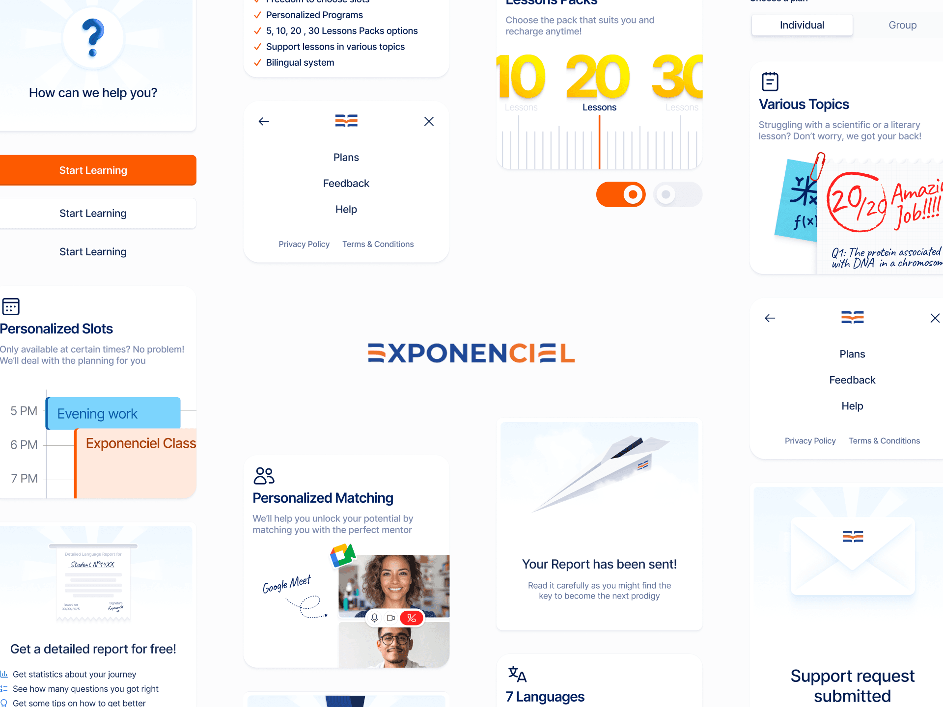
Exponenciel is an innovative educational platform, created by enthusiasts of education and new technologies to satisfy the growing needs for flexible, personalized and modern education. I designed their new on-boarding journey that aims to determine each client's level and encourage them to join their courses.
Company
Exponenciel
Role
UI/UX Designer
Timeline
1 Month
The Problem
Exponenciel had an on-boarding experience that consisted of a dry list of multiple-choice questions, it fell short on accurately determining clients level and convert them into long time students.
The Goal
Turn the boring dry assessment into a fun and frictionless language assessment experience that's narrative driven, engaging and effective. Clients would get immediate results and recommendations to upgrade their current level through custom 1:1 or group lessons.
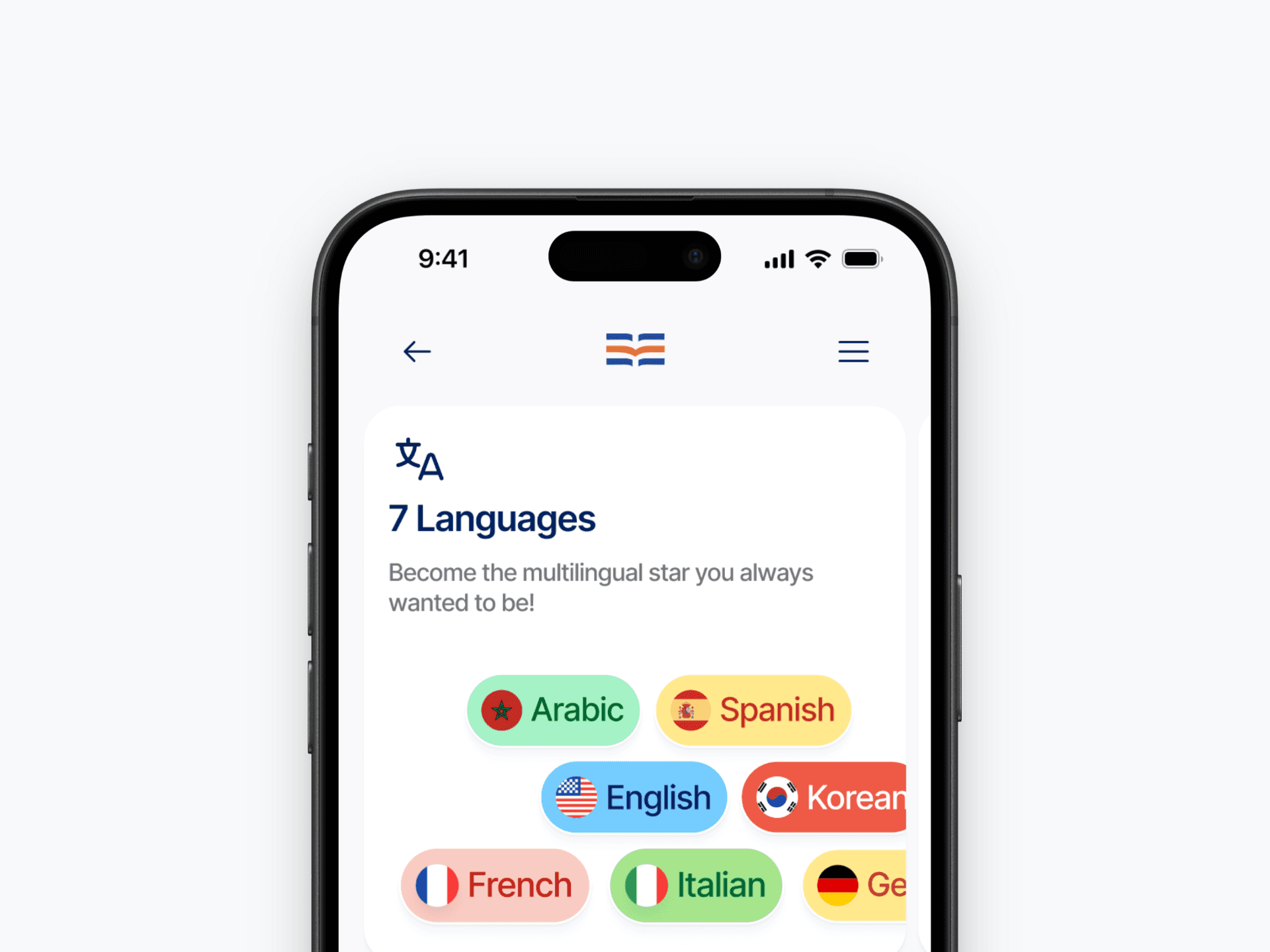
Journey Strategy
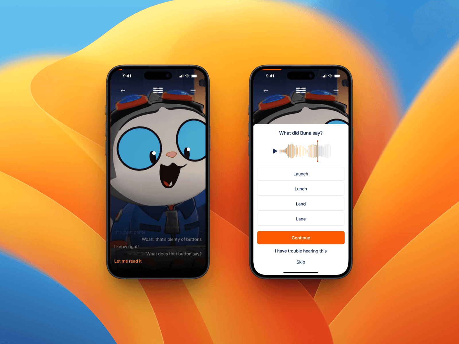
The test had to include 20 mixed format questions so structuring the test around bite-sized cutscenes was the ideal approach. This would divide the narrative into small, engaging chunks that hold the user's focus.
Since we are in the era where short-form content is king, It made sense to make each cutscene run for 15~30 seconds (the sweet spot for short-form video platforms), keeping the full experience under 10 minutes to prevent burnout and time waste.
This approach ensures smooth flow between questions and leverages modern viewing habits for better retention.
One-Shot the Assessment?
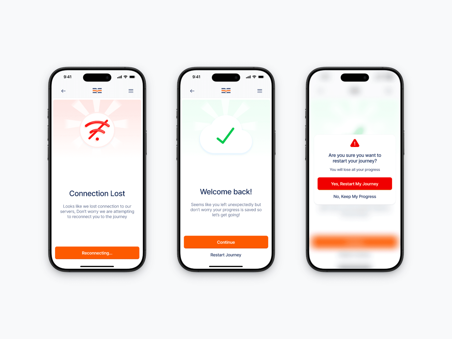
One of the key requirements was completing the 20-question assessment in one uninterrupted session, this raised challenges like handling external disruptions beyond our control.
Even the most engaging journey can't guarantee against interruptions from hardware failures, software glitches, or life events. Those are factors that's entirely out of our hands.
My proposal to auto-save progress to the cloud from the start made sense, so I proceeded to add reconnect options for disconnects and made sure to at least capture essential user info like email for resumption reminders in case the user decides to postpone the assessment.
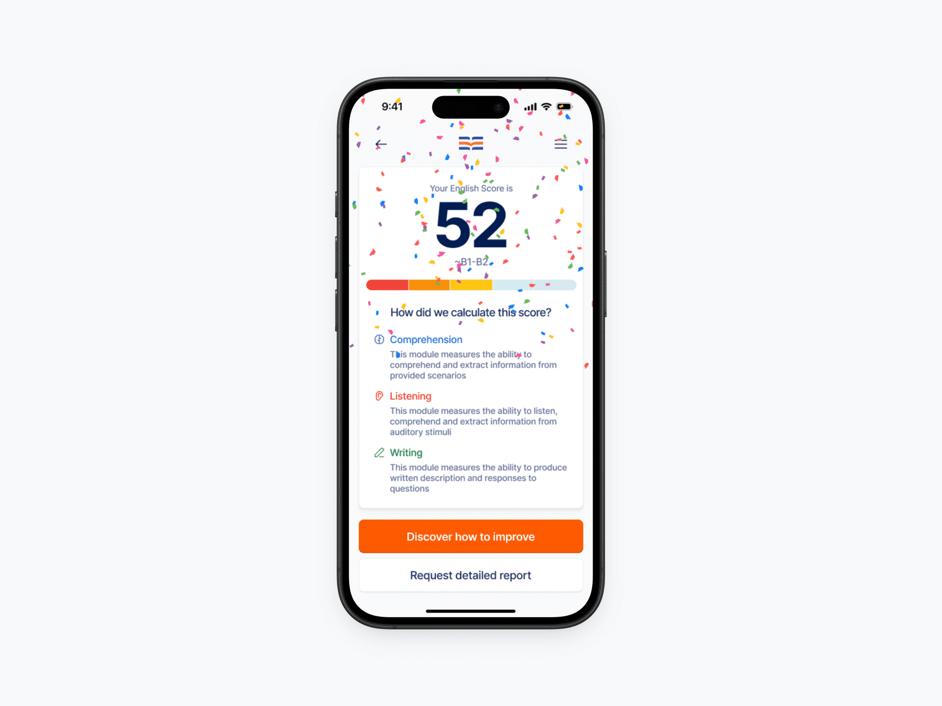
Gamifying the scoring system
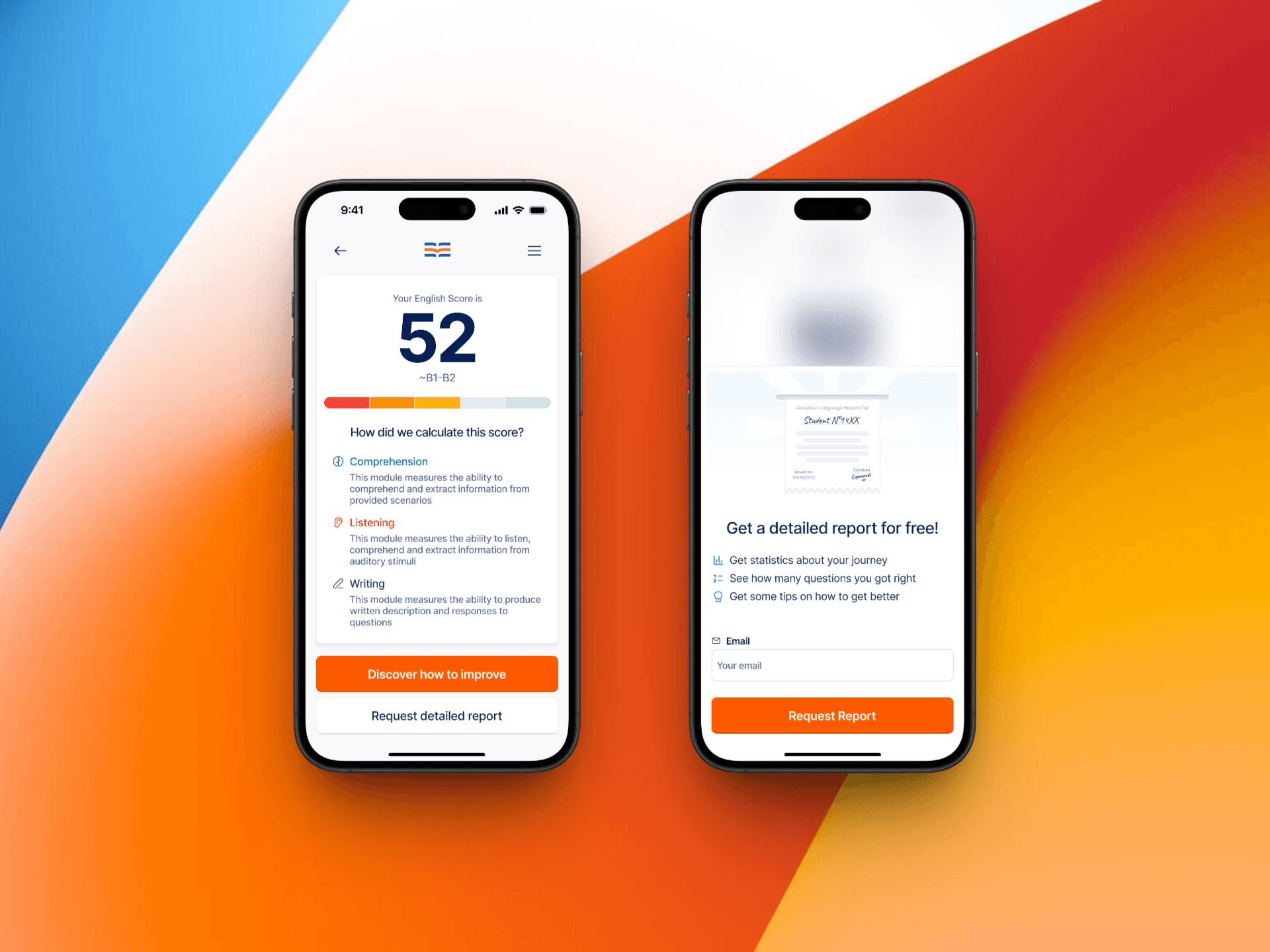
The original brief called for showing levels using CEFR levels (like A1 or A2), but I advocated to add a 100-point score alongside it for greater user motivation.
This encourages users to self-challenge and peer competition, pushing users to invest effort, enroll in classes, and track real progress. It visualizes growth from start to mastery, turning assessment into an inspiring journey.
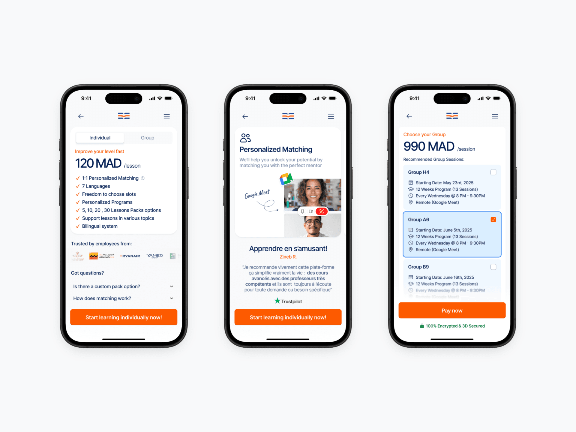
Lead capture opportunity
After refining the core experience, the final push was convincing clients to enroll in online lessons.
I designed clear plans screens with essential elements: illustrations highlighting offerings, paired with real client reviews and FAQ section dedicated to answer client's questions. This makes the value clear and trustworthy to potential clients.
Delightful animations
I always prioritize care in my designs, so I wove micro-animations across multiple screens to bring the app to life with a unique, polished touch.
These subtle motions reduce user uncertainty by providing clear feedback, guide attention to important elements, and infuse the product with a warm, human feel.
Success State
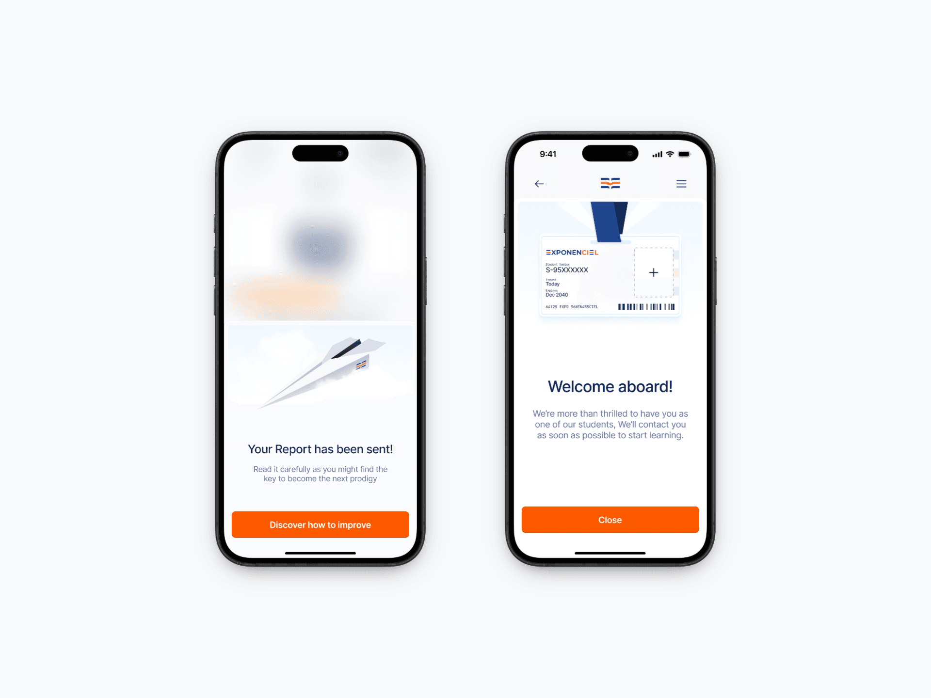
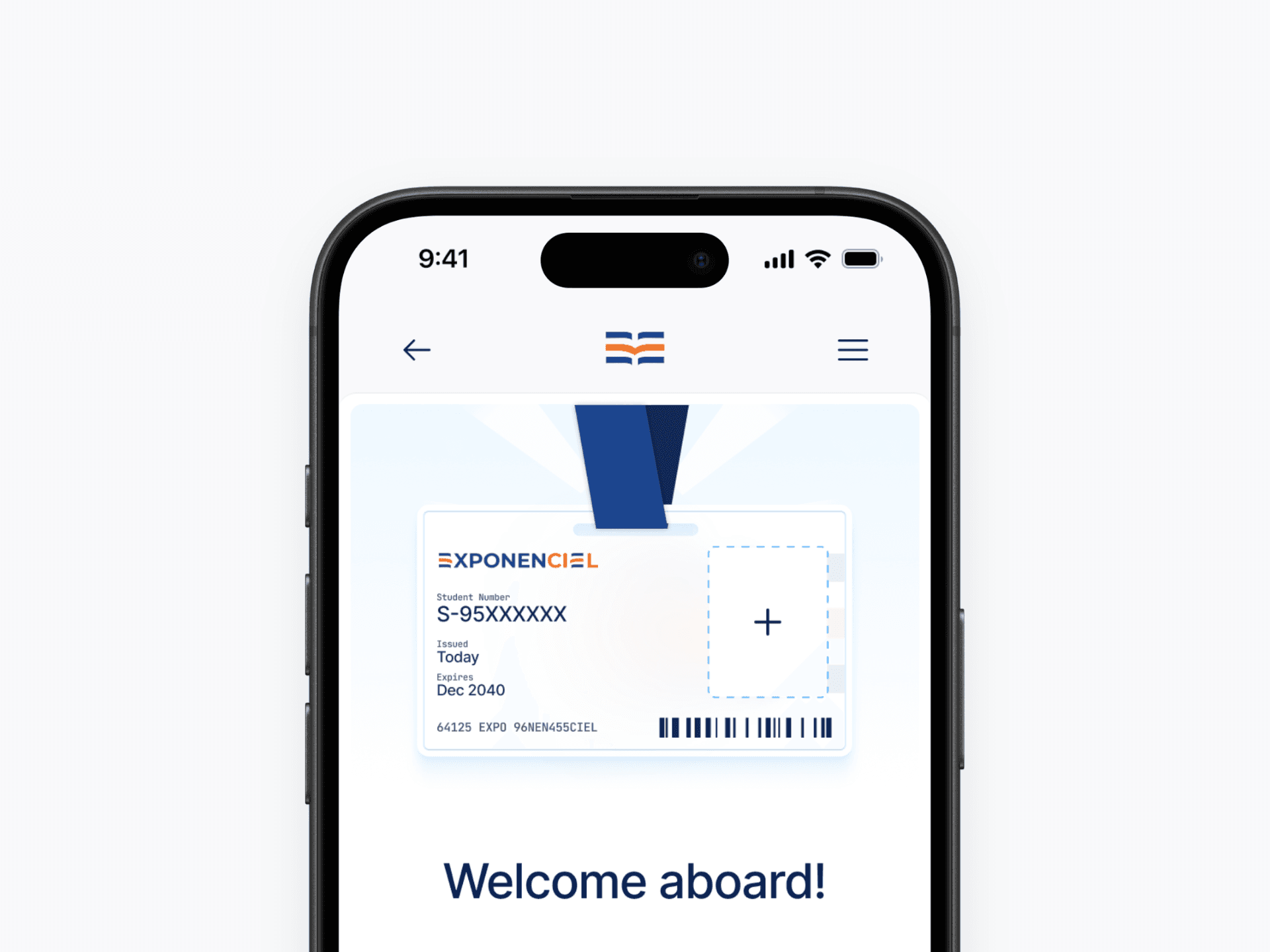
For the final screen before having access to the platform, I thought it would be better to illustrate a student card instead of having a simple "welcome screen". This gives the feeling that the user is part of a real learning platform by giving them a unique number and the option to add their own picture if they want to.
Final thoughts & reflections
I absolutely loved working on this project, the entire journey formed instantly after I read the brief and with each iteration I designed, more and more ideas kept pouring in to push it even further. Of course there were more things I wanted to add but that would be left for later versions.
Always keep technical limitations in mind
While some ideas are great, it's important to keep time and technical limitations in mind, especially with a small team, leaving the some features for later shouldn't be considered a negative.
Animate at the right time
While some might think animating everything is good, choosing the right time when and when not to animate a component is one of the key differentiators between good and great products.
“We were lucky to work with Abdellah on a UI/UX design for a new onboarding process. Abdellah quickly understood the customer pain we were trying to solve, came up with solutions, and filled in the blanks. He delivered a complete Figma design, with clear flows and a comprehensive design system. But most importantly, Abdellah works with minimal guidance and check-ins, which makes him a strong candidate and an A player.”

Ahmed A.
Co-founder @Exponenciel